Breadboard UI Updates (Nov 13, 2024)
It’s been another busy period for the Breadboard Visual Editor - there are lots of changes to share with you all!
Multiple tab support
A key change we’ve wanted to make for some time is to support multiple tabs and, with it, the ability to work with several boards at once. Well, that’s finally here!

Auto-saving Boards
Not strictly a UI update, but it’s cool so we’re including it! If you have the permission to edit the board you will now see a small icon to the right of the board’s name. This indicates the current auto-save status of the board. Whenever you make a change to a board it will be automatically saved to its Board Server, meaning you should never lose changes accidentally.

If you prefer to keep things manual, however, you can switch off auto-save in the settings.
Overlays
In the past, configuring components was done in a panel to the right of the Visual Editor (or the bottom if you’re one of our portrait screen users!). Now, however, we have overlays which you can access by clicking on a port’s name or its value.
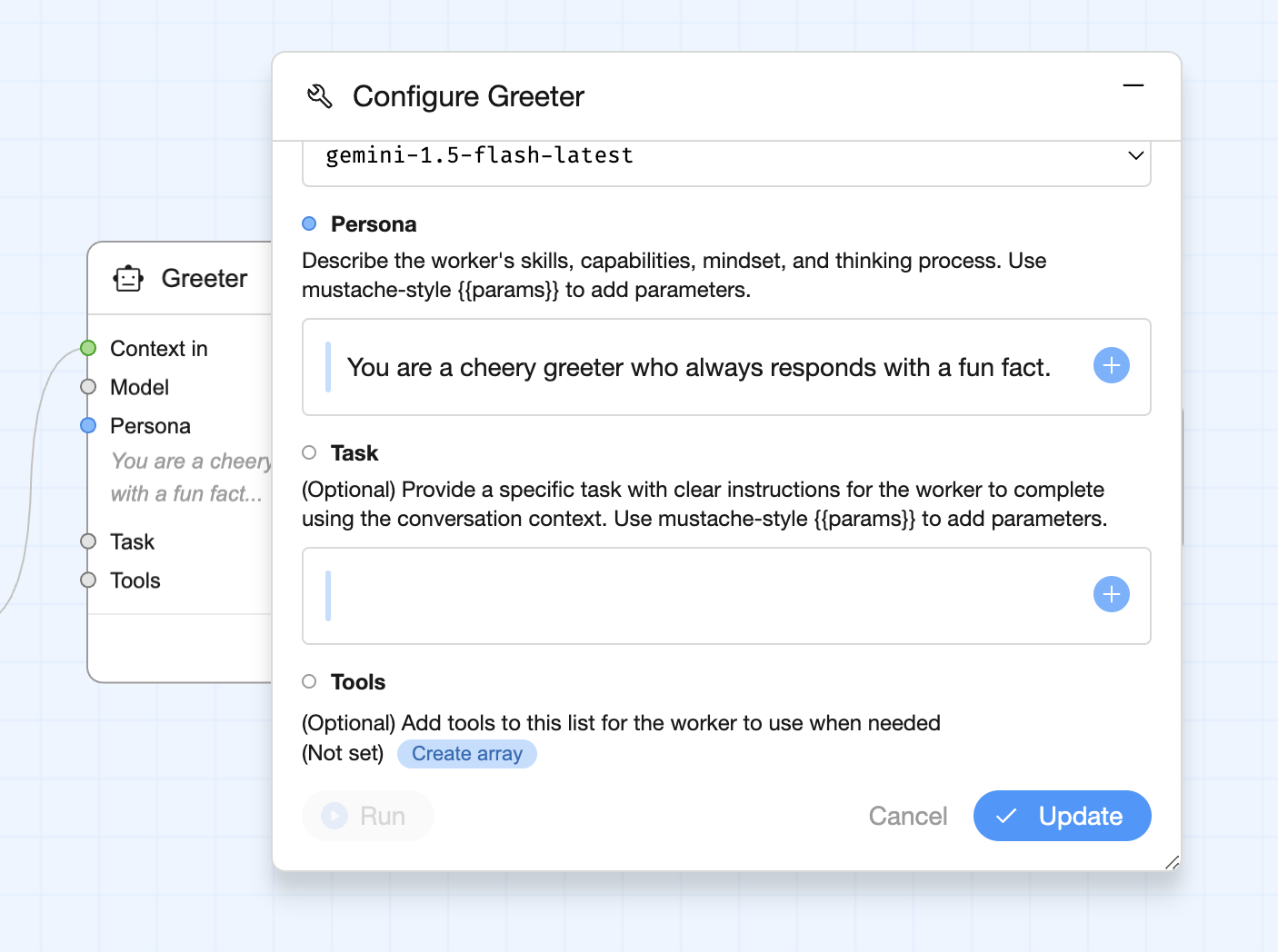
This has allowed us to free up the right hand side of the Visual Editor’s UI, meaning we have more space to move around the board. But you may have also noticed that the board’s run activity was displayed on the right, too, so where has that gone?
Drag & Dock Overlays, and an Updated Board Activity
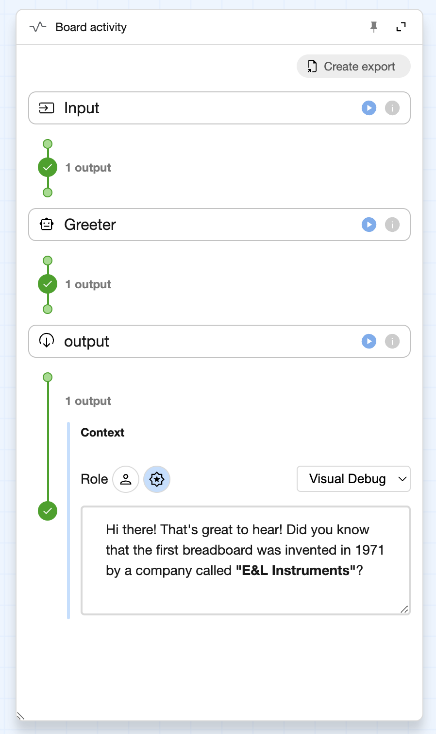
Not content with one overlay, we also moved the Board Activity to an overlay. This one is fairly similar to the component configuration overlay, but it also allows you to dock the Board Activity to the side of the UI as well as pin it, meaning it will stay open until you click on the Board Activity button the toolbar at the top of the UI.
And speaking of the Board Activity, that, too, has changed. The look & feel of the Board Activity has been updated to more closely match the board, making it easier to follow. As well as visual changes it also shows the outputs of every component, making it easier to debug your boards.
Streamlined Schema Editor
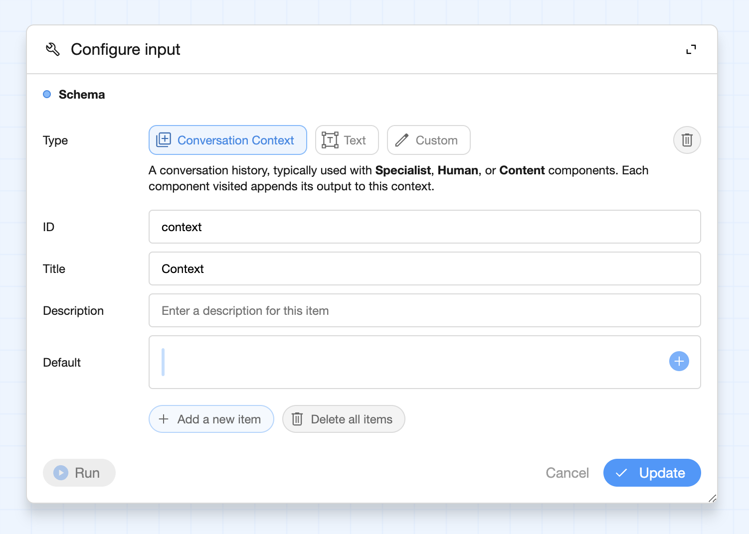
We were finding our old component schema editor a bit fiddly, especially when a lot of the components we deal with use the Gemini API Content type. So we’ve simplified it, offering the Conversation Context type (which is broadly the same thing as an array of Content objects), a text type, and finally a freeform schema editor in case you need to go off-roading!
A ribbon menu, and a new Component picker
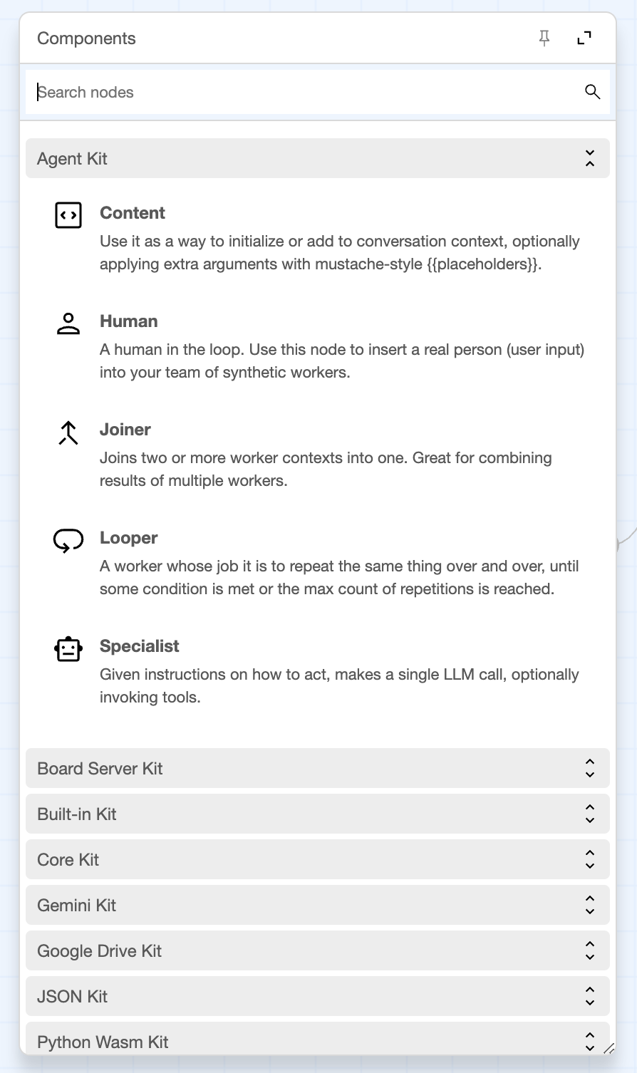
Next up, we’ve consolidated the various menus and so on into a single ribbon menu that sits just below the tab. Here you’ll find options for adding components, editing the board information, saving & deleting the board, as well as a host of other options for navigating and managing the graph layout.

In here you’ll also find the new Component picker, which, like the Board Activity, is a drag and dock overlay.
Wire status
One big change you’ll see in the updated UI, and which is matched by the Board Activity, are color and value indicators on the wires. For example, in the image below you’ll see the wire is purple and it has a marker with a tick in it. This indicates that the preceding component has generated a value for the wire, but that value has yet to be consumed.
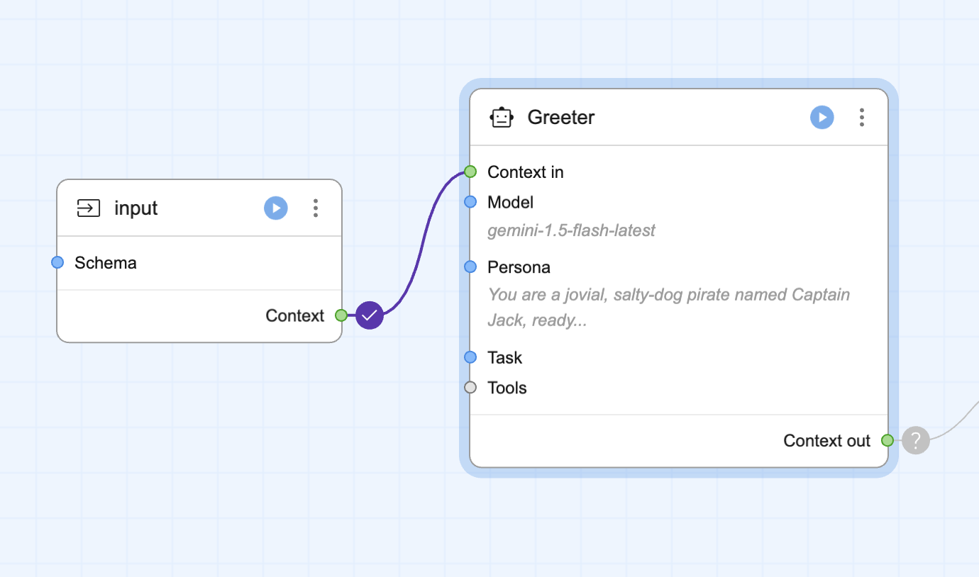
As the board continues running, the wires turn from purple to green as the values are consumed.
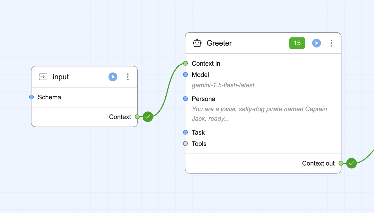
At any time you can click on the wire’s marker to see the value that was generated.
Port listings on components
When a component is minified we now show any ports which are configured or missing (those which need a value via wire or by filling in a value). This means you can get to the configuration much more easily, and you can see which ports are yet to be populated!
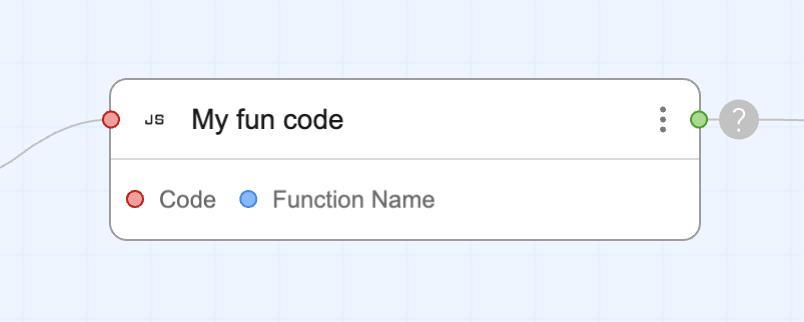
Lots of little quality-of-life improvements
Finally, we’ve been working hard to improve things in other small-but-meaningful ways, such as adding support for middle-click dragging, tracking the active tab in the URL so when you refresh you come back to the same board, adding more tooltips to the UI, simplifying the overall color palette, and including more icons for components.
Phew! That’s a lot of changes!